veja magazine
Editorial - UI/UX Design | 2016 ~ 2018
{Graphic Designer at @VEJA}
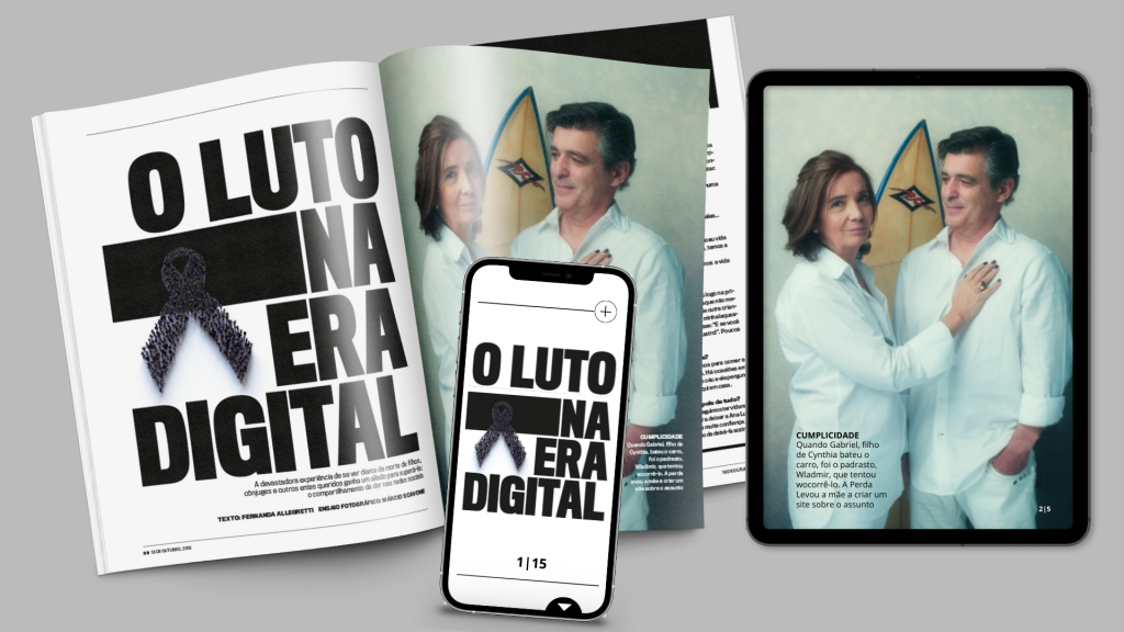
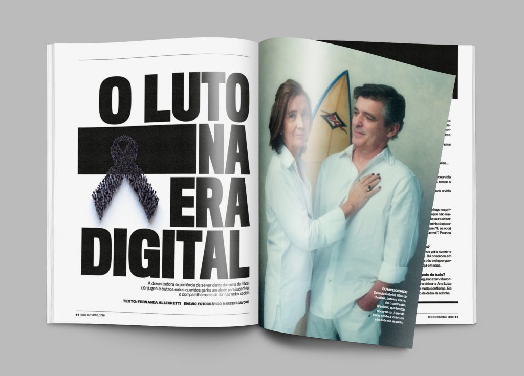
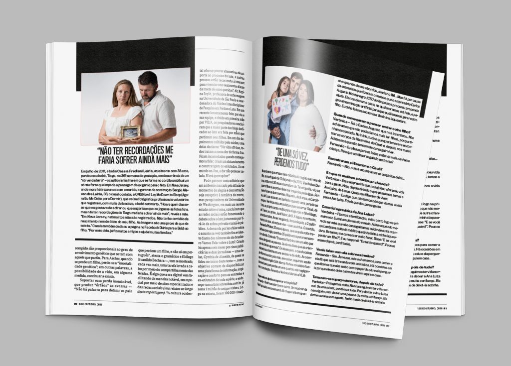
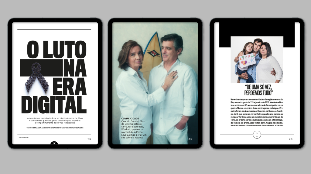
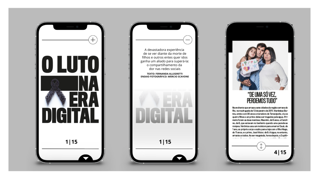
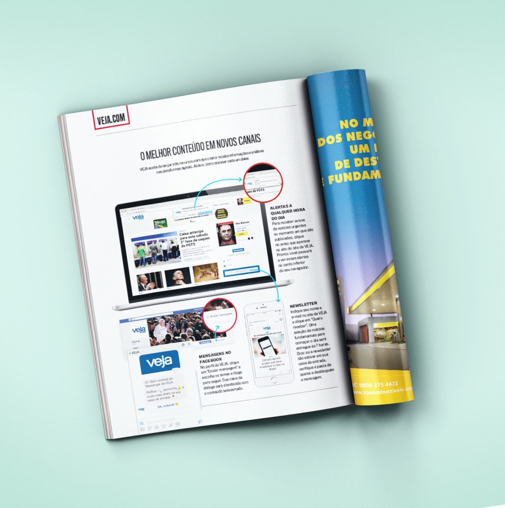
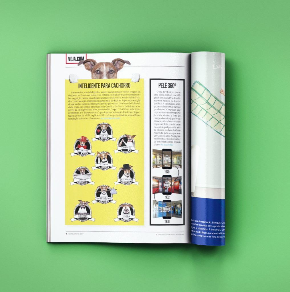
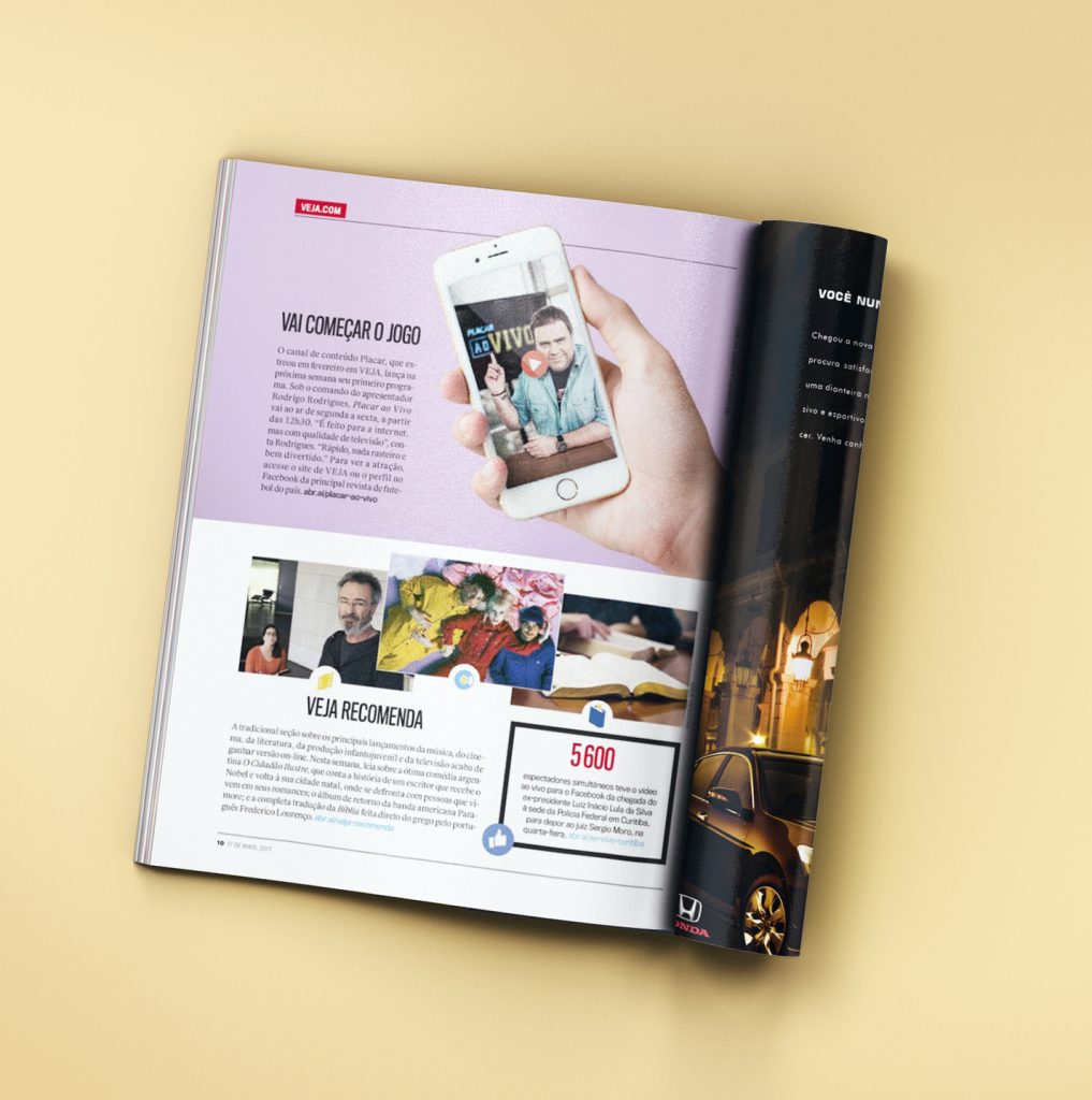
VEJA is the the second-largest and most widely read weekly magazine of the world. Designers were responsible for creating the articles both in print and digital versions, respecting iterations, usability, and extra content - as video, animation, voice over, blippar (AR), 360º interactive covers.
The magazine is published weekly every Wednesday, since 1968, and counts with a national circulation of over one million copies, the majority of which are subscriptions. Its structure consists of about 112 pages, a smartphone and tablet application.
To maintain a weekly workflow, the Art Department has the responsibility of curating the best ways to display the information to the readers, both in the print and digital versions of the magazine. The Photography Department works side by side, deciding whether or not to produce pictures or to buy them from agencies and the listed photographers.
Often each issue has about 40 articles, and designers will be responsible for about 4 to 5 articles per week. The designer then will touch base with the journalist who is writing the article, decide a concept, and work on the print issue. Then, as the article is being developed and the visuals being chosen, the designer works together with the Photography department, deciding what is the best way to edit the images, creating the best visual composition, often deciding for extra content as videos, cuts, b-roll, that will later be used in the digital issue.
The designer is present in all the steps of conceiving a magazine.
*DISCLAIMER: This project does not have all of its documentation steps due to contract and copyright reasons. I am allowed to show the final project I was responsible for, but not the backbone-structure and process that belong to my former employer.*

