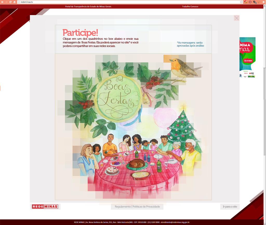
RedeMinas TV - 2013 Holidays
UI/UX Design | 2013
UI/UX Designer / Marketing Analyst @ Rede Minas
Rede Minas is a public television network in Brazil that serves millions of viewers across the state of Minas Gerais. I idealized and executed the 2013 Holidays Digital Campaign.
Revealing the Magic: How a Pixelated Photo and Interactive Landing Page Created a Memorable Holiday Campaign
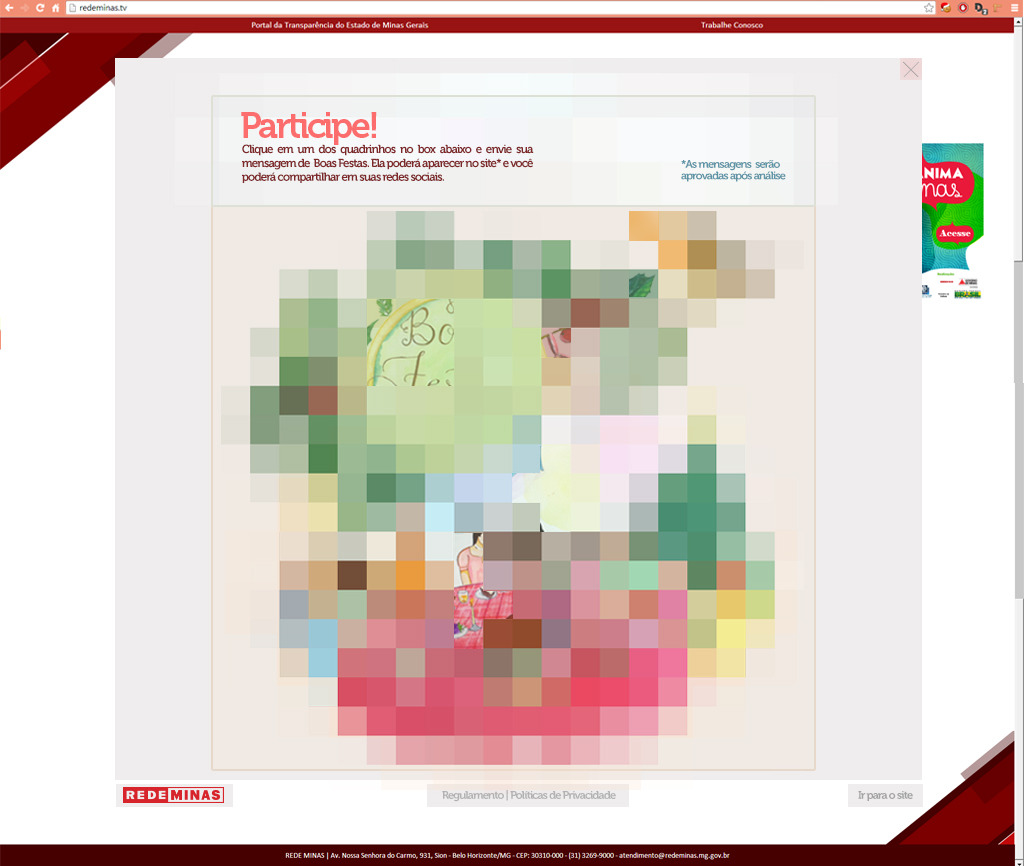
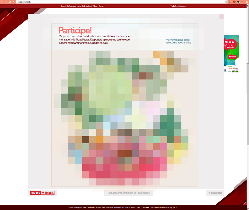
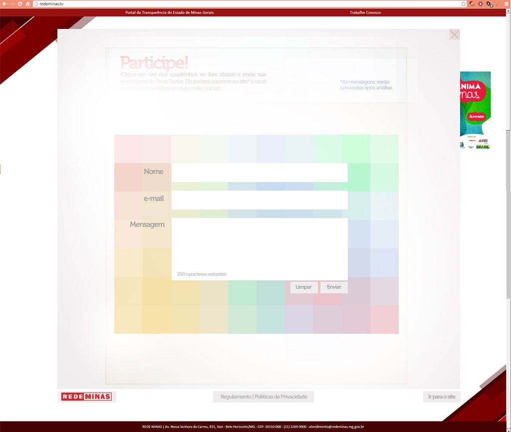
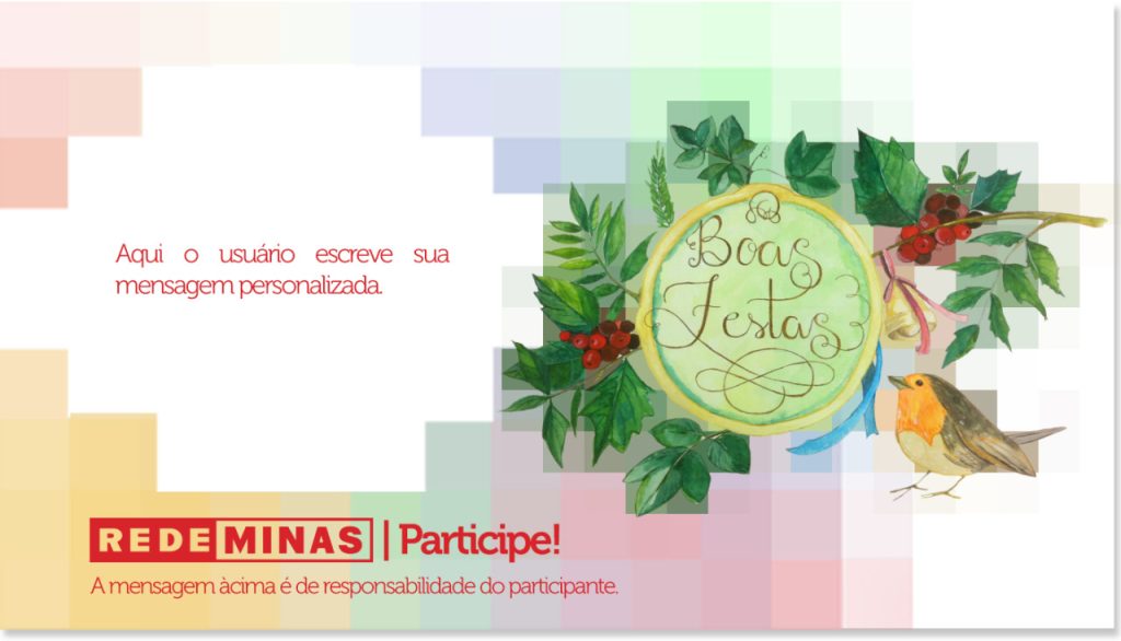
In 2013, I had the opportunity to create an exciting digital campaign for Rede Minas. I conceptualized and executed the entire campaign from scratch, which included ideating an interactive landing page for users to send digital e-cards via email or post on social media. The landing page featured a huge pixelated watercolor – also made by me, that gradually revealed a larger picture as users filled out cards throughout the holiday season. This culminated in the grand reveal of the complete image on New Year’s Eve. As a result of the campaign, Rede Minas received positive feedback from viewers, and engagement and viewership increased significantly during the holiday season.
To create the interactive landing page, I utilized my expertise in user experience design to ensure that the site was intuitive and easy to navigate. This involved designing user flows that guided visitors through the card-creation process, selecting appropriate imagery and graphics, and creating a seamless user experience across different devices and platforms.
Throughout the design production process, I worked closely with the development team to ensure that the design was translated seamlessly into the final product. This included providing detailed specifications and assets, reviewing and testing prototypes, and making design revisions as necessary.
The resulting 2013 holidays digital campaign for Rede Minas was a success, with positive feedback from viewers and increased engagement during the holiday season. My design production skills played a key role in achieving this success, and I continue to use these skills to create engaging, effective, and visually stunning digital products.

